Design
J463 Poster
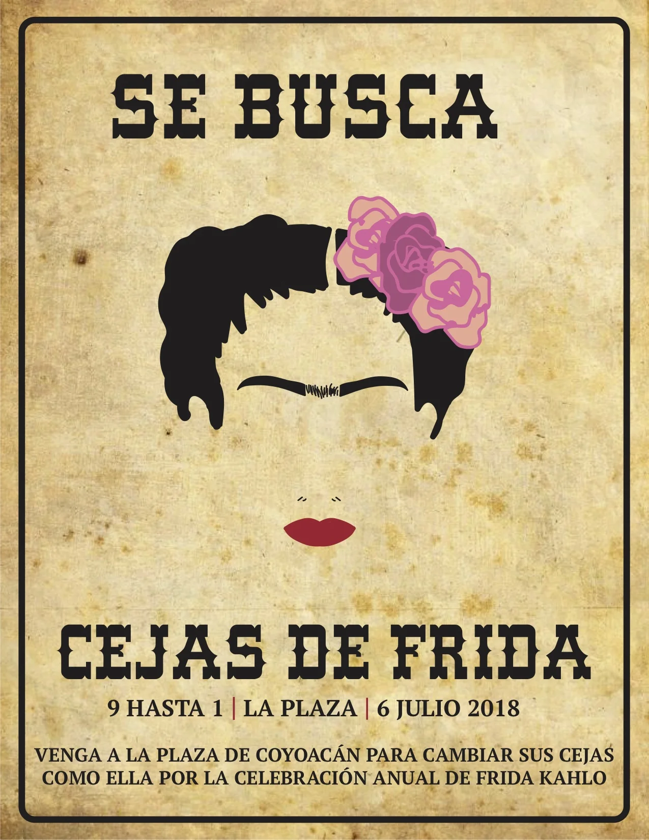
I decided to make an old-fashion western wanted sign but in Spanish, for a warrant out for Frida’s eyebrows. But in the end, it is just a celebration where people can celebrate Frida Kahlo and all of her art and accomplishments.
Translation of Poster:
- Se Busca = Wanted
- Cejas de Frida = Frida’s eyebrows
- 9 HASTA 1 | LA PLAZA | 6 JULIO 2018 = 9am-1pm | The Plaza | July 6,2018
- VENGA A LA PLAZA DE COYOACáN PARA CAMBIAS SUS CEJAS COMO ELLA POR LA CELEBRACIóN ANNUAL DE FRIDA KAHLO = Come to the Coyoacán Plaza to change your eyebrows like her for the celebration of Frida Kahlo
I think that I met my goals of being innovative and funny because of how my friends (both Spanish-speaking and non-Spanish speakers) felt about my project. My goals for my poster were to be different and have multiple genre influences in one poster, hence the minimalistic face and wanted sign fonts and background. I believe the most successful part of my design was Frida’s eyebrows. They look just like her real ones and have texture in between the uni-brow. I painted over each hair in the portrait mask and made sure that they stood out like hers from afar.
In the future, I need to work on having one idea and sticking with it and not getting mad at myself. Like Hannah Montana says, nobody’s perfect! I ended up receiving a perfect grade on this project, and my professor said "Really impressed that you were not afraid to abandon something you were not happy with, Erin! Wonderful job."
J463: 6-Page Print Project

Click on the image above to see my 6-page project
The goals for my publication were to be edgy yet minimalistic. I feel as though the colors give it the edge it needs, but the fonts keep it simple. It took me awhile to think of a target audience but in the end, I would classify it as chic yet rebellious concert goer. I think my final project portrays this.
As far as typography, I got my inspiration from FADER, Complex, and Wired. I am a music junkie and loved how each of their front covers and name plate were bold but nothing too complicated. I wanted to keep it consistent so I did that all throughout the spreads, there were glimpses of the same type. I really was attracted to the Mohawk man for the front cover. It screamed rock ’n’ roll and will easily grab the attention of many. A photo says a thousand words and this photo may even say a thousand and one. The pink, red, and oranges on the front cover were striking. I wanted to use it throughout but I didn’t want it all to look feminine and only for a certain group of readers. I decided to leave out the pink and hold onto the orange and red throughout the spreads because multiple images had different hues of these colors. After messing around with Photoshop and trying to make a mask on the skinny hairs of the Mohawk man, I got frustrated and chose a different cover: aka Big Ben. It all worked out and I enjoy the blue a lot more than the pinks because I think it would tie the magazine spreads in together well.
Throughout the creative process, I learned that I started to fall back on my knowledge of newspaper design. Everything was looking too straight and boring and I needed to spice it up a bit. Some mistakes I made throughout this process was making photos too small or too big. Either someone would strain their eyes to see the detail or be annoyed if there was accidental pixelation. I also learned that sketches don’t help me when it comes time to think of fonts and it is exhausting. These mistakes taught me that design requires a decisive, firm, and open-minded personality. Without it, your time will be soaked up with “what if’s” and “that could be better if I just…” An area that I can continue to work on with design is that it’s not how I feel about it, but how others will feel when they see it.
The hardest part about this project was leaving it alone at the end. I always thought maybe it could look better a certain way, but I ended up going with my first choice. Overall, I think that my magazine turned out really well!
C226: Two Page Magazine Spread
Mary M's Walnut House
One of my main projects for my Visual Communication class was to find a local business in Bloomington and create a photo story about their trade. I was new to town but found peace as soon as I walked into Mary M's Walnut House, a flower shop on the south side.
I interviewed the shopkeepers, as well as other staff, to find out more about the history and best-selling products in the store. It was then required that I make a realistic two-page magazine spread from the photos and interview material that I had packaged together in two weeks. The two images above are the results of a few overnighters and a lot of feedback from profs.
J463 Front Page of Newspaper

Newspage Design
This was my first major project for my Graphic Design 1 class at IU. My dad worked in the newspaper business for a while so I saw many print newspapers throughout my childhood.
As a class, we were given 6 stories to chose from with multiple images, and we had to decide what would be the most newsworthy for the Chicagoland area. I chose the Crestwood story about contaminated water to be my CVI and biggest headline. It is apparent to see the visual hierarchy of the other stories through the size in font and how much space they took up on the page. I only went with 4 stories after all because I didn't want the page to feel too cluttered.
I also had to choose every typographical decision so I took colors and themes from the photos and weaved them into my design.
We were also given promos and teasers to chose from, so I took the Super Bowl and made a huge box out of what I was given. I knew that it would be great to incorporate the players into the nameplate like they were running out to the audience.
My favorite part about this project was creating the weather bar at the bottom of the page. I never used Illustrator before, but I ventured out to YouTube to find some tutorials for how to make clouds and raindrops. Weather is very important in Chicago, because it is likely to affect a majority of everyone's commutes, so I thought it was necessary to include this element.